Natalie Lanese

Photo credit: Bob Perkoski
Natalie Lanese is an artist based out of Cleveland, OH, though she previously lived in Brooklyn, NYC, and Toledo, OH. Known for her evocative and playful use of color and site-specific works, Natalie continually pushes herself and her craft forward. She has been featured in New American Paintings, been selected for a number of residencies and awards, including an Ohio Arts Council Individual Excellence Award, and has installed both permanent and temporary works throughout Ohio and across the country.
Natalie’s works are constantly evolving, in style, process, content, and craft. In her work she marries a midwestern work ethic with academic thoughtfulness, and playful contemporary approach. In this, she creates works that are instantly accessible and fun but leave viewers and critics much to crawl around in. There is a physicality to her work, a body of terrains that evoke a sense of stepping into places filled with whimsy, nostalgia, and sometimes even terror for their sheer scale and depth.
Natalie received a Master of Fine Arts degree from Pratt Institute in Brooklyn, New York. She earned her Bachelor’s degree at Xavier University in Cincinnati, Ohio, and a Master of Arts degree at Case Western Reserve University and the Cleveland Institute of Art. She lives and works in Cleveland, Ohio.
Visit Natalie: www.natalielanese.com
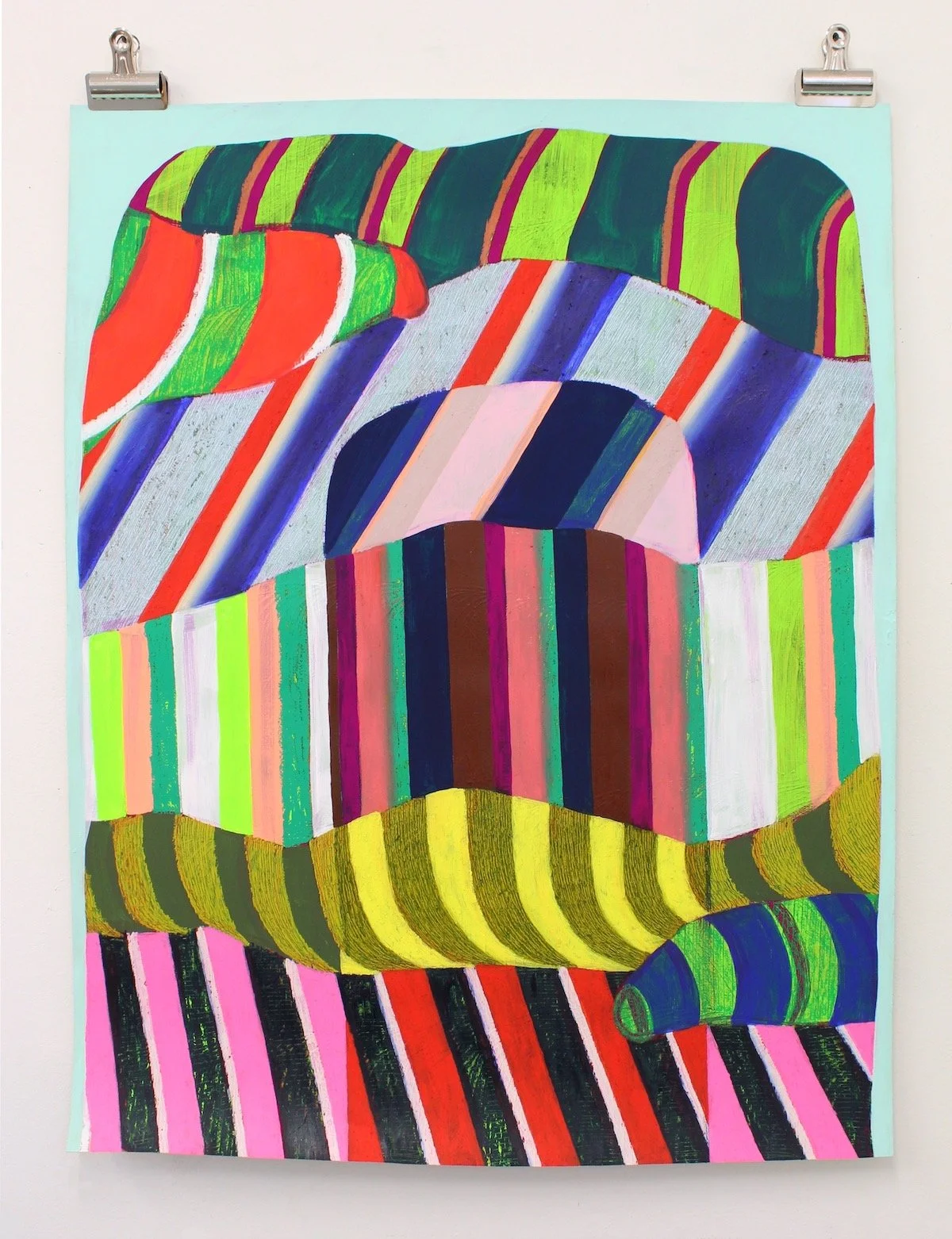
I’m curious how you think about content in your newer works? In the time I’ve known you, you’ve had this wonderful evolution from collage with playful images and narratives to almost brutal terrains. The through-line being your focus on color and roots in exploring camoufleur. The work here is something beyond abstract though. There is still an imagistic quality, the works feel like they are moving or alive, and there is this almost geological sentiment cloaked in fantastic patterns.
When you think about your evolution, what are you exploring and where do you reconcile the communication for the viewer between content and craft?
My newer works are a direct response to changes and challenges I’ve experienced in the last couple of years and are inspired by the last decade since returning to Ohio and living on the coast of Lake Erie. I love the phrase you used, “brutal terrains.” I think that perfectly describes both physical landscapes that inspire the work, and an interior turmoil I’m responding to. Where past work was an all-over pattern, confined only by the edges of the canvas or walls of a gallery, these newer paintings are contained shapes that represent mountains, boulders, and piles. The shapes are compressed and constricted within the picture frame with only a small margin of negative space. They are frontal and confronting.
I’ve also been thinking about heft and how I can make these shapes and colors feel heavy. A lot of experiments over the last year and a half have attempted to solve this, either by mixing materials into the paint, working on rough surfaces, or propping the paintings up. I’ve continued to work with heavily layered patterns and saturated colors to create density. The color is joyful yet uncomfortable.
I think the through line has been in color and pattern, and I hope viewers recognize that as the work evolves. I’ve always been attracted to challenging color contrasts, and those that defy what’s pleasing. There is a lot of tension in the paintings, they’ve become a battleground, and I think that’s what makes them so active. There is movement in the composition, the colors vibrate, and the textures and surfaces shift as you move in front of the piece.
In my material experiments, I’ve gone out of my way to make the process harder for myself. I am using giant oil sticks on heavily-textured surfaces. I’m working with stiff paints and tiny brushes over large areas of the paintings. I’m struggling with new tools and materials I haven’t used in years. The surface has history that tells that story.
As someone who is not an expert of the color wheel, I find your use of color wild! You pull from these really extreme palettes and cram things together that seem like they shouldn’t pair but compliment each other quite well. Why is that important to you? What do you learn about your medium? And why is Day Glo important in that conversation?
Thank you for recognizing this and asking about it! Color is so important to me. I think it is the part of my work that most represents me. In general, it’s important to be at least a little uncomfortable, so I look for ways to make colors create discomfort in the painting. I don’t want the color to sit still. There is usually something to grab onto–a familiar color association or trendy combo–but my choices are personal and nostalgic, or rebellious and repellent, and others result from a decade-long dialogue with DayGlo colors, which provide a constant challenge.
I pair the DayGlo colors with colors that absolutely shouldn’t work together, and through a process of trial and error, I figure out how to make them work. Their intensity is challenging in creating balance, and since these colors need to be pure to function at full power, I’m not mixing them with other colors, but rather using optical mixing by placing colors next to each other, a technique derived from divisionism and neo-impressionist painters.
Used for high-visibility safety and marketing signage, DayGlo colors have a utilitarian application, but are also associated with low-brow blacklight paintings, kitsch, and a childlike aesthetic. I like to wrap all this content up in my palette.
You’ve long spent time in the installation space, presenting your works in 3D, or in contexts where they are meant to disappear after some time. Ephemeral art is always whimsical, but I wonder for you what purpose and challenges you’re exploring by letting this labor go?
I wouldn’t say I’m letting it go. Making site-specific work requires an invitation to create work in a museum, gallery, or someone else’s space, and the last couple of pandemic years interrupted opportunities to make installations due to closures and a lack of in-person events. Working on multiple surfaces, three-dimensionally, and creating temporary work is always on my mind, and I plan to continue making work in response to architecture and our physical relationship to a space. Pivoting to making objects has been necessary due to circumstance, but it’s also something I’ve wanted to do for a while, so though this is my interest at the moment, I still plan to continue making work in various modes.
You’ve fairly recently transitioned to being a full-time artist, including undertaking residencies. What have you been surprised to learn about yourself in this new light? Have these experiences changed or impacted your goals for yourself or your work?
I think the main thing I’ve learned is how hard it is to be a full-time painter. I definitely had some delusions about making a living as a painter prior to taking this step (ha). I think other disciplines bring with them skill sets that are applicable in other contexts, but painting sometimes feels like the most useless of all.
I have so much pride in what I do, though, that I’m determined to prove that painting is necessary and important. It feels like a futile and selfish exercise some days, and then I attend a residency and live with other painters for a month and am reminded that it isn’t futile at all. We collectively believe humanity needs this language and we’re responsible for fostering it.
I’ve been self-employed for 4.5 years and I’m exhausted, scared, not always as financially comfortable as I’d like. I thought I’d be doing a lot more public art, and those projects would provide a major share of my income, but those opportunities haven’t been as numerous as I hoped. So I’m dreaming up other income streams, trying to protect my studio time, and wondering if I should just get a day job! The important thing is I’m on my toes and that’s a good place to be. As long as I’m a little uncomfortable.